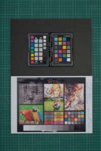
coming back to the color calibration chart. after so many test prints i recognized that i did not compare my self-made prints against a high quality print of the source file.
for this test i have used the color calibration print from finerworks. on their webpage they provide a color calibration image as a pdf file. but you can order this chart as a print as well – what i did. however, this print actually is intended to be used as a reference for adjusting monitor settings. i like this chart because it contains several types of images – black&white, saturated image, art image and a color chart which seem to have the same color patches as the color checker passport from calibrite. no guarantee, but i would think darktable is able to use these patches with its color calibration module.
in addition to the test prints i have already done a while ago, i wanted to have the high quality chart print in comparison to a premium photo paper. because, i’m using a standard epson ink-jet printer at home.
i have downloaded the digital version of the calibration chart from the finerworks webpage. for further processing i had to converted it to an image file. since i’m using linux there is a binary, which is able to convert pdf pages into images – i’ve converted it to a png!
pdftoppm "$filename" "${filename%.*}" -png
luckily the source image contains color patches showing the hex value of some colors. this should help for a fast check with gpick, whether the png version still has the right colors. which was ture! but … there might be … some other investigations needed! for the moment, just two words – color management 😅
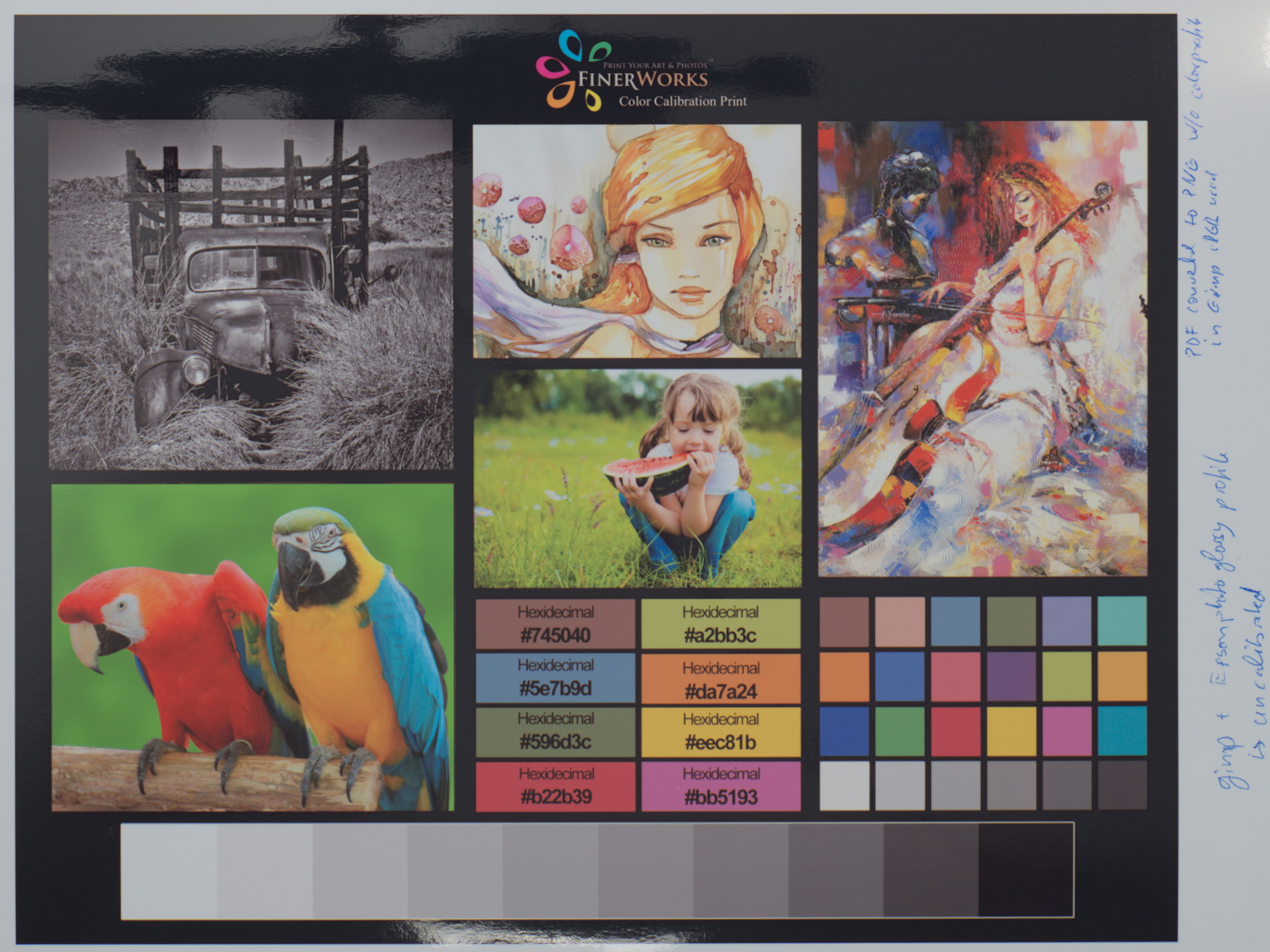
here we have the finerworks print of the calibration chart, the original, the high quality. as well as for all later prints, i took a photo, which i have processed in darktable. i did only minimal editing and did a color calibration and crop.
i do not know much about the paper the finerworks chart is printed on. neither it’s nothing written on the paper nor mentioned in the receipt or on the webpage. i just can state that it is a high quality not glossy at all print. the black is really dark and the contrast towards white is huge. the colors are shiny and saturated. a very usable image for adjusting a monitor. if the monitor wouldn’t backlit the digital and the print would look the same.
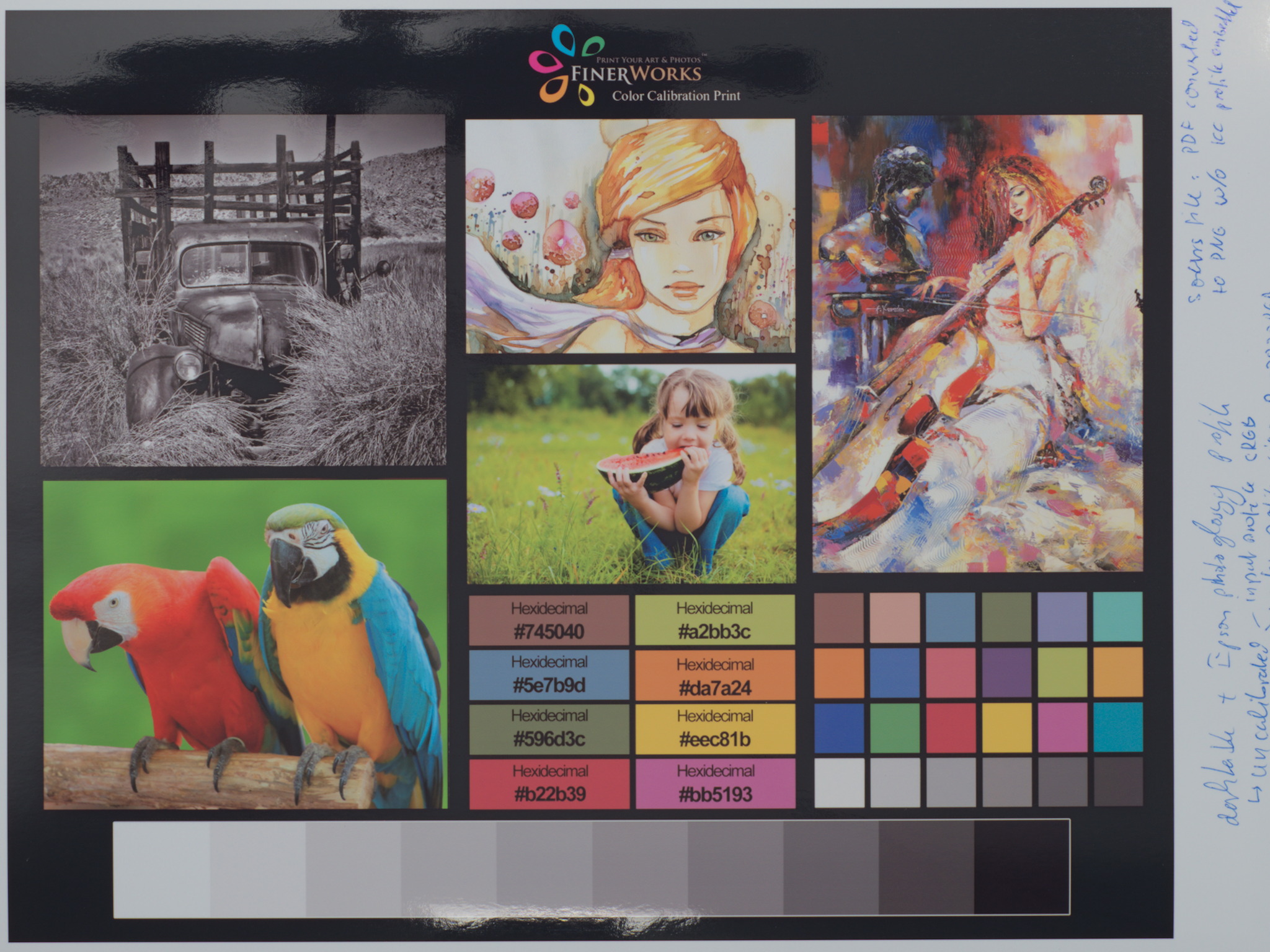
this is the first ink-jet print done out of the png. here i have used gimp for printing! why? so i want to make sure that, if a #DA7A24 should be printed – a #DA7A24 is printed! i have discovered … color management!! 🥴
ok …, just in short. i’m using ubuntu; monitor is calibrated with displayCAL and the color profile is active; i’m using a lot gimp and darktable – both are able to handle monitor profiles! the converted png file does not contain an embedded icc profile and therefore, it’s might be a bit unsure how programs interprets colors. most likely, i guess they fall back to sRGB. so, if i hover with a pipette over the color patches, gimp shows corrected hex values! this makes me confident that the correct colors are printed 😅
actually i prefer more darktable for printing over gimp. but since i figured out, that there might be an issue with the color picker of darktable (i do not want to believe that the color management is working incorrectly). in darktable the pixel values of the hex values to not match! now we have an unanswered question! even if look directly into the bits of the image, i can see the hex values e.g. #DA7A24. but why shows the darktables color picker different values. i have changed darktables input and work profile settings. i have even set back the history stack to zero/original. not any of the settings resulted after in correct values. they’ve been always a bit off from what they should be.
edit: need to say that darktable version is always HEAD 😅
nevertheless, i trusted the system and printed the color chart!
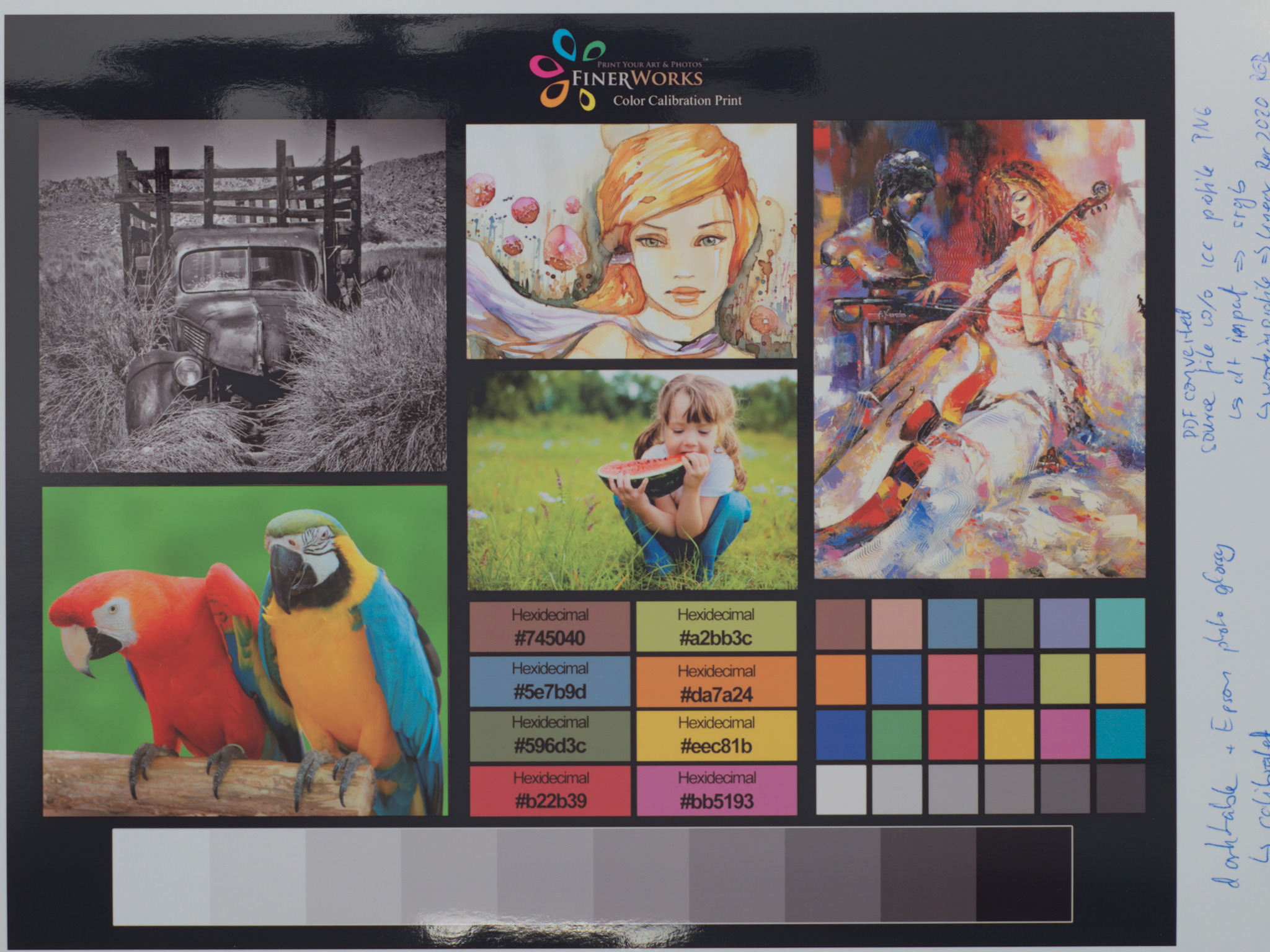
what to do, if unsure whether the colors of the png are processed and printed correctly with darktable? at least doing a color calibration of the image in darktable and hope it is processed correctly! 🤞
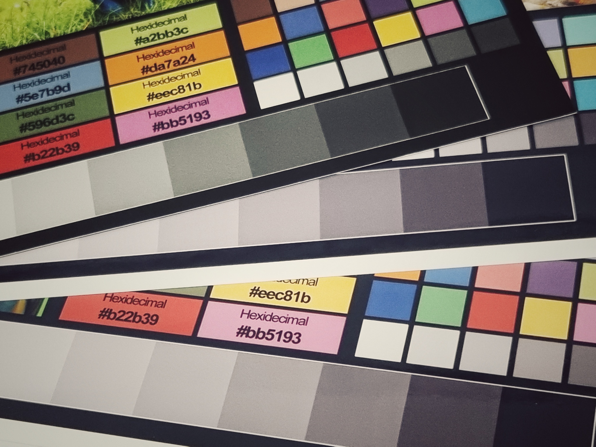
this was the last of three prints i need to compare to the color chart from finerworks. all the prints are now on the same epson premium glossy photo paper.
general speaking all three ink-jet prints look really the same. i’m not able to see any differences in the color tones. comparing the three prints against the digital version on the screen, in my opinion, they come very close as well. the used paper is glossy and normal/standard ink is used. it is reasonable that the black for instance is not the deepest black and therefore the prints have less dynamic. but overall, it proves to me, that it doesn’t matter which tool was used, results are the same. it might be that the color picker in darktable is buggy. however, i can say that it looks like the png was handle correctly with or without calibration. but if i have to mention one issue – i would state that the red has on my prints an orange touch. you can see it especially in the parrot. i hope it is just the limitation of the ink.
below is a comparison of the finerworks print and the chart printed on epson photo paper. the overall better quality and higher dynamic range and contrast of the finerworks chart is clearly visible. the difference in the red tone is here noticeable as well.


a last challenge!
despite the ink-jet prints have less contrast and dynamic range, can we get the them back having the same saturated look as the digital version has? below another comparison between the digital and an edited version of the printed chart. i would say they come close in terms of color and contrast. what is your opinion?


